The above picture was taken sometime during 1977 in Harlem in Manhattan. This picture would have been around the time of the New York Blackout of 13/14 July 1977. From the position of the sun, it appears to be a morning shot. I decided to do a little investigating to find out how the northeast corner of 123rd Street and Lexington Avenue has changed from 1977 to recent times.
 |
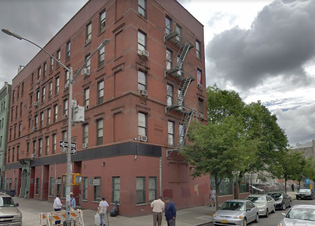
| The same spot in July 2018 (Google Street View). |
I honestly wasn't too hopeful about finding the exact spot using Google Street View, as there isn't a lot of information given in that photograph. However, it turned out to be surprisingly easy. The address of the shuttered store to the right pinpoints the location. Although the building directly ahead has been modified over the years, it still stands and retains many of its characteristics from the 1970s.
As I point out in many of the comparisons in this series, the addition of trees during the intervening decades has dramatically improved the ambiance of ordinary streets like this. The stark angles and unforgiving sidewalks now are softened by a touch of green.
The building itself has been altered. It appears to be completely residential now. Whereas the corner had a typical "candy store" and a diagonal front to accommodate foot traffic, that has been straightened with characterless severity. The ubiquitous cigarette and liquor ads on the wall behind the men at the table (a real corner hangout!) are gone, reflecting a general decrease throughout Manhattan in billboards of all types. However, the windows on the building behind them are the same forty years later, as is the fire escape. The no-parking pole on the right also remains there, though at some point in time someone has straightened it. Hey, that's progress, folks!
The most notable difference is the absence of the gritty building on the right. In its place are a couple of trees, and perhaps the people who live in the building now have a backyard. There seem to be fewer street-level businesses in the area, which may not necessarily be the greatest thing for the neighborhood. However, the absence of gritty and ugly roll-down anti-theft shutters definitely is an improvement from an aesthetic point of view. The area certainly looks like less of a battle zone and more like a generic residential area. Let's call it gentrification. Considering the crime wave that accompanied the blackout that summer, however, those shutters may have saved the store owners a pretty penny.
Just a slice of life, a moment in time. The past lingers on in our memories and the locations.
As I point out in many of the comparisons in this series, the addition of trees during the intervening decades has dramatically improved the ambiance of ordinary streets like this. The stark angles and unforgiving sidewalks now are softened by a touch of green.
 |
| A little further out, with the original location at the lower right center (Google Street View). |
The building itself has been altered. It appears to be completely residential now. Whereas the corner had a typical "candy store" and a diagonal front to accommodate foot traffic, that has been straightened with characterless severity. The ubiquitous cigarette and liquor ads on the wall behind the men at the table (a real corner hangout!) are gone, reflecting a general decrease throughout Manhattan in billboards of all types. However, the windows on the building behind them are the same forty years later, as is the fire escape. The no-parking pole on the right also remains there, though at some point in time someone has straightened it. Hey, that's progress, folks!
 |
| And still further out to give context (Google Street View). |
The most notable difference is the absence of the gritty building on the right. In its place are a couple of trees, and perhaps the people who live in the building now have a backyard. There seem to be fewer street-level businesses in the area, which may not necessarily be the greatest thing for the neighborhood. However, the absence of gritty and ugly roll-down anti-theft shutters definitely is an improvement from an aesthetic point of view. The area certainly looks like less of a battle zone and more like a generic residential area. Let's call it gentrification. Considering the crime wave that accompanied the blackout that summer, however, those shutters may have saved the store owners a pretty penny.
 |
| The demolition of the building to the right in the original photo changed the entire character of the area (Google Street View). |
Just a slice of life, a moment in time. The past lingers on in our memories and the locations.
Anyway, I hope you enjoyed this entry in my "The more things change, the more they stay the same" series. Please visit some of the other then-and-now comparisons!
2021
2021

I was in that picture in 1977...lol the one with the black hat and the white t shirt behind the dominoes game.
ReplyDeleteFunny, the guy on the left sitting down was my Dad. I was trying to find the photographer who took this photo to try to get a better replica and created a framed version for my Mom. Cheers.
ReplyDelete